Intro
The winter 2021 BUEC season ended with exciting upsets and an engaging livestreamed finals - but what was more exciting to me was the release of a new season of exciting BUEC data to look at 🤓! I somehow managed to convince my lecturer that doing analysis on uni esports data should count for my degree, so two weeks later, here we are!
Before we get started, all of the graphics here have links underneath, where you can make your own graphics with the data set and look at how your uni did compared to others! Alright, let's get right into it:
but first... what are BUEC points and how do I get them?
BUEC (British University Esports Championship) Points are awarded to teams that compete in NSE's student esports tournaments each year. Unis can have multiple teams for each game, and teams earn progressively more points based on how far they make it in a tourney (so, 1st place will get 150, 5th will get ~100, 10th will get ~60... all the way to 120th getting a measly 1 point).
Does size matter?
One of the first things many people do when they see the BUEC table is put it down to the size of an institution. This is a reasonable assumption to make, for lots of reasons, but is it actually true???
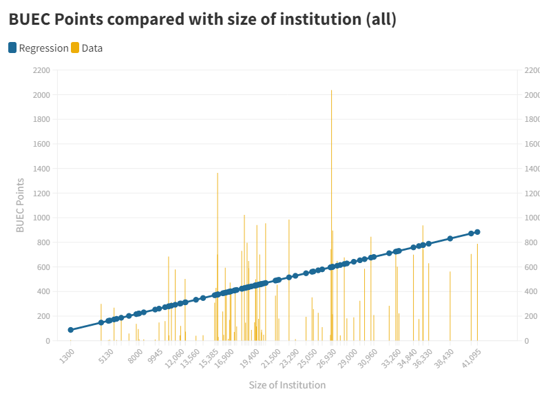
It turns out, that there IS some credence to this claim. If we compare university sizes with the BUEC table results we get the following graph:
(link)
This finds a pretty clear positive relationship, and with a relatively high correlation coefficient as well (0.3907)!
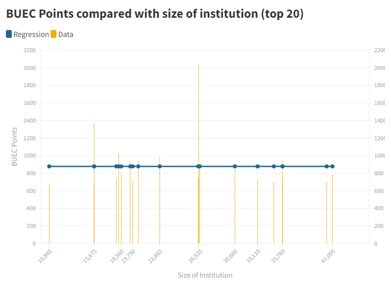
However, this doesn't tell the whole story. This is looking over the ENTIRE data set, and we are looking at a lot of small universities that fielded very few teams, and so will have a high variance in their points earned. If we only looked at the top 20 teams in the BUEC, we get the following graph:
(link)
Now, we see that there is absolutely zero relationship between the two variables! So, what does this tell us?
Well, this tells us that student-body size IS very useful in predicting whether or not a university will get a decent number of points in the BUEC. However, once we know that a university is getting a decent number of points, then it appears that size makes close to ZERO impact on how many points a university gets!
Zerg Rush!!!
So, if size doesn't matter at the top of the leaderboard, what does? A natural question to ask is where universities are getting their points from? Are they fielding many weaker teams and just "Zerg Rushing" the BUEC points leaderboard? Let's try and find out.
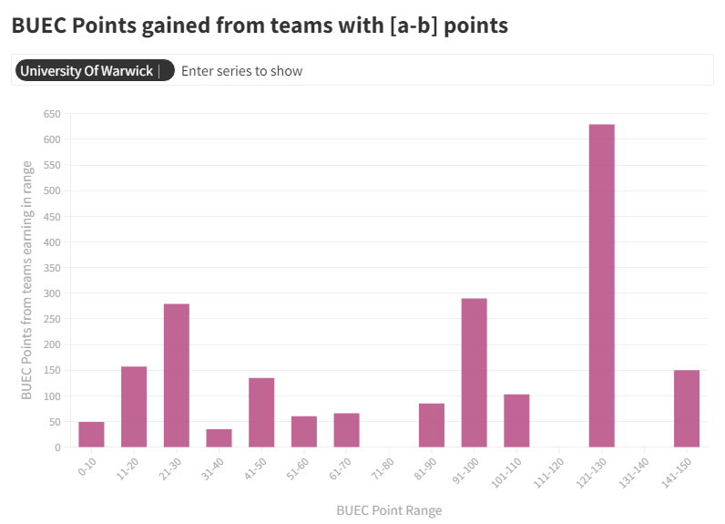
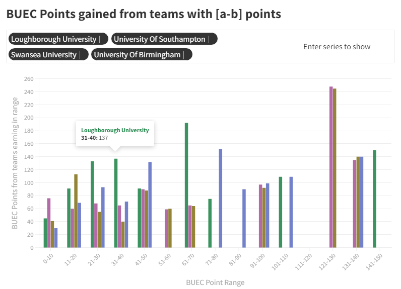
We can count how many points each university gets from each team that earns a certain amount of points. Then, we can bin these together and slap them on a graph:
(link)
For example, from this graph we can see that Warwick seem to get their points from two peaks, one from weaker teams and another from stronger teams - but hardly no points from intermediate strength teams.
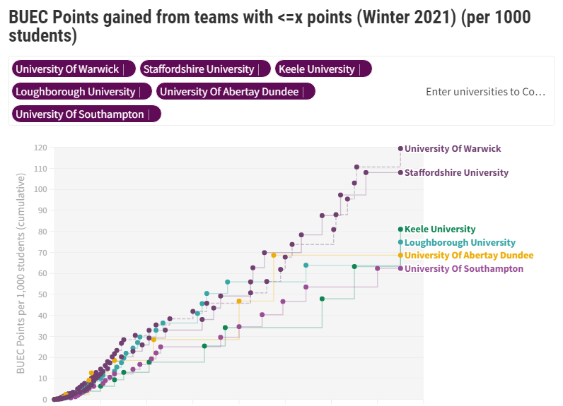
However, this method quickly gets confusing when we try and compare multiple universities:
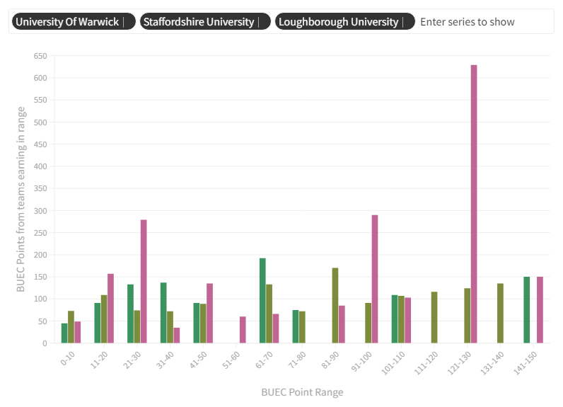
(link)
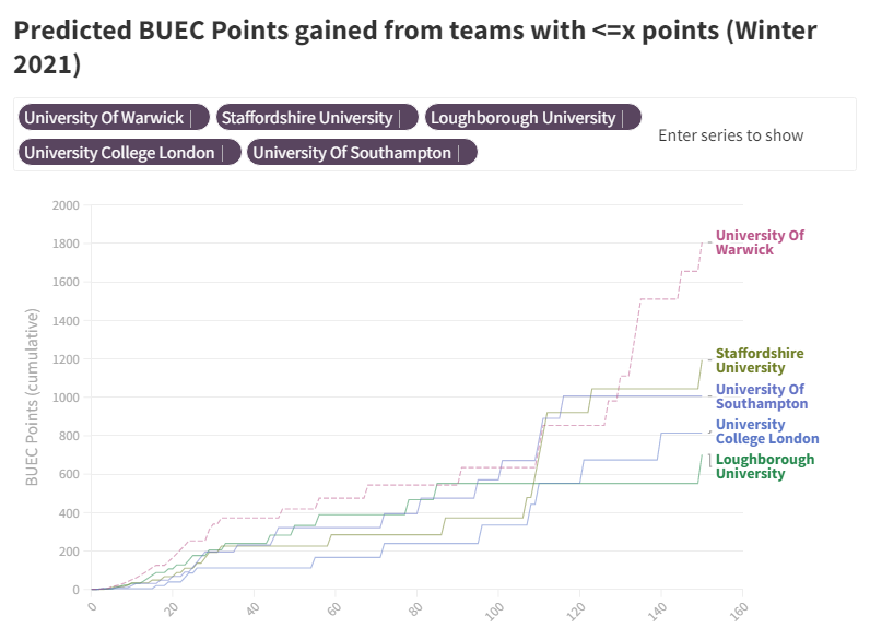
So, we can transform this data into a "BUEC point race", to better compare different universities:
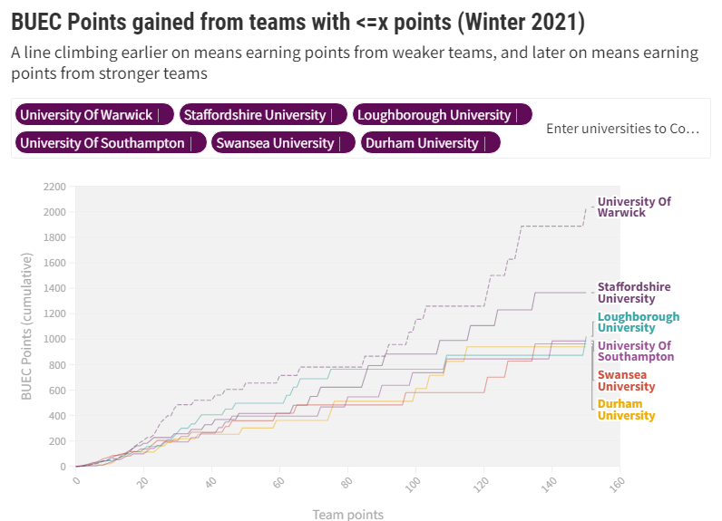
(link)
We can learn all sort of useful insights from these graphs.
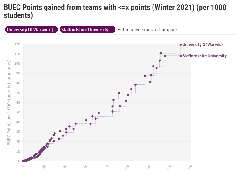
For example, if we compare the 2 points leaders (Warwick and Staffs), we can see that they are neck-and-neck in points for most of the race, but Warwick pulls away towards the end once stronger teams are included:
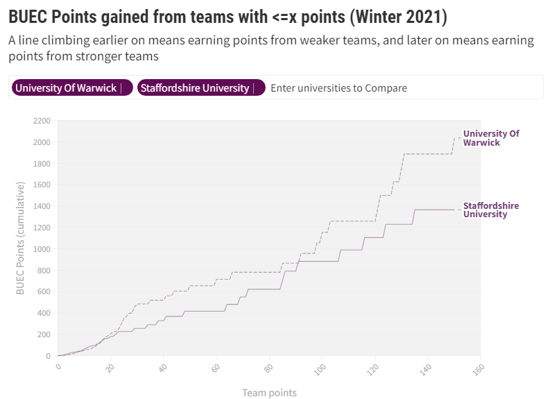
(link)
Another fun race to watch is the battle for 3rd place. It's razor close, with many universities justling for the position:
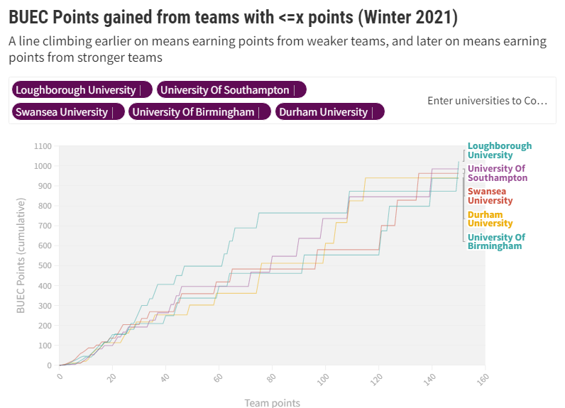
(link)
Interestingly, it looks like Loughborough might well be guilty of Zerg Rushing their way into 3rd place, because they seem to gain most of their lead from weaker teams, especially in comparison to their closest competitors:
(link)
Adjusting for size:
We can actually adjust for size when it comes to these races, and we get a brand new table:
(link)
There are several interesting insights from this adjusted graph. First and foremost, Warwick and Staffs have both retained their original positions of 1st and 2nd (althought the gap has closed a lot). When you directly compare the two, it's shocking how similar their curves look:
(link)
Perhaps more interesting is how the fight for 3rd place, and the rest of the table, has changed so dramatically. We see new risers Keele and the University of Abertay Dundee break into the top 6, and really give Loughborough a run for it's money
This is not to say that the original top 6 didn't deserve their places. To quote a wise man, "it is, what it is". But, these smaller uni's successes are nonetheless impressive, and should be celabrated!
The power of institutions
We have one last surprise data set to look at. Thanks to the generous staff at NSE, and me relentlessly DM'ing Hench and AlphaKenny, we have access to the seeding data for this terms tournaments (unfortunately we don't have access to seeding data for affilliate leagues, so they aren't including in the following results).
We can compare this seeding data to the actual results, to get a guage for how well unis overperformed their seeding, (or underperformed in some cases):
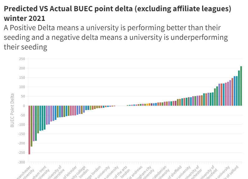
(link)(link that lets you compare different universities/search yours up)
If a university has a positive points delta, that means they outperformed their seeding by a certain amount, and a negative result is an underperformance.
We can see that Loughborough had an impressive season, outperforming their seeding by over 200 BUEC points (maybe I was too harsh before!)
Staffordshire, on the other hand, seems to have underperformed quite badly, earning over 200 BUEC points less than expected (although this makes their 2nd place all the more impressive).
There were other impressive winners and losers, but I'll leave that for you to find out, because this is already very long 😅
(You can use this link if you want to search up and compare specific universities)
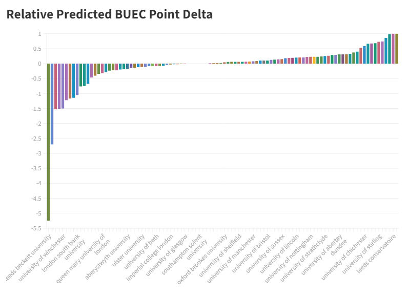
We can also adjust this delta, to find out how much % a university beat their predicted points by. (1 = beating your points by 100%, -1 means getting 50% of your predicted points...):
(link)(link that lets you compare different universities/search yours up)
Of course the elephant in the room here is Leeds Beckett University, with quite an underperformance. However, it should be noted that this metric is particularily sensitive to variance, especially for smaller universities. For example, if a university was predicted 6 points (coming ~130th in a tourney) and actually got 1 point (coming ~140th). this would be a score of -6, so take the results of universities with very few teams with a grain of salt.
Lastly, we can have a little fun and recreate the BUEC table, to see what things would look like if EVERY university performed exactly as their seeding would predict them to:
(link)
I like to call this one the "fake" BUEC table, but hey, at least you can now use this to flex how well you should have done last term xD.
Again, as a reminder, not only are these seeding predictions, but they also DONT include affiliate leagues, like Smash, which Staffs did very well in. If you want to see how your institution did only for non-affiliate leagues, just add together the predicted score and the delta from the previous graph :)
Feel free to use any of the graphics discussed/linked here in any way you wish. You can give credit if you want, or not, entirely your call.
If you have any questions about any of this, feel free to DM me on discord: CheeseLordP#7864
Also if u wanna see me create uni esports beef with these stats follow me on twitter: twitter.com/alextpet
If you would like to use any of the data sets involved here/ see the code used to preprocess them, you can find them in this google drive folder. (Proper comments for the code is coming soon tm)
Lastly, thx to RiceyBeMe for talking to me about this work and inspiring it with their previous work:
https://nse.gg/news/buec-points-stats-and-maps/


